Problem 1
Weak brand recognition
The feed lacked a consistent, recognizable visual identity.
Details
Company: Arencia, Korean skincare
Timeline: Jun – Aug 2026
Role: Creative Marketing Intern
Platform: Instagram, @arencia_global
Focus: Art direction, content creation, competitor research, social media strategy
Summary
During my internship at Arencia, I worked with the marketing team to rebrand the brand’s Instagram and strengthen its visual identity in the U.S. market. I researched past campaigns and competitors, then developed a creative direction deck around three key brand values: artisanal, natural, and scientific. I collaborated with the filming team on three shoots, each focused on a different brand value, to create a cohesive 12-post Instagram grid and a short-form video.

Overview
Context
As Arencia prepared to expand into U.S. retailers through the Sephora x Olive Young partnership, the brand wanted to build a stronger presence among U.S. consumers.
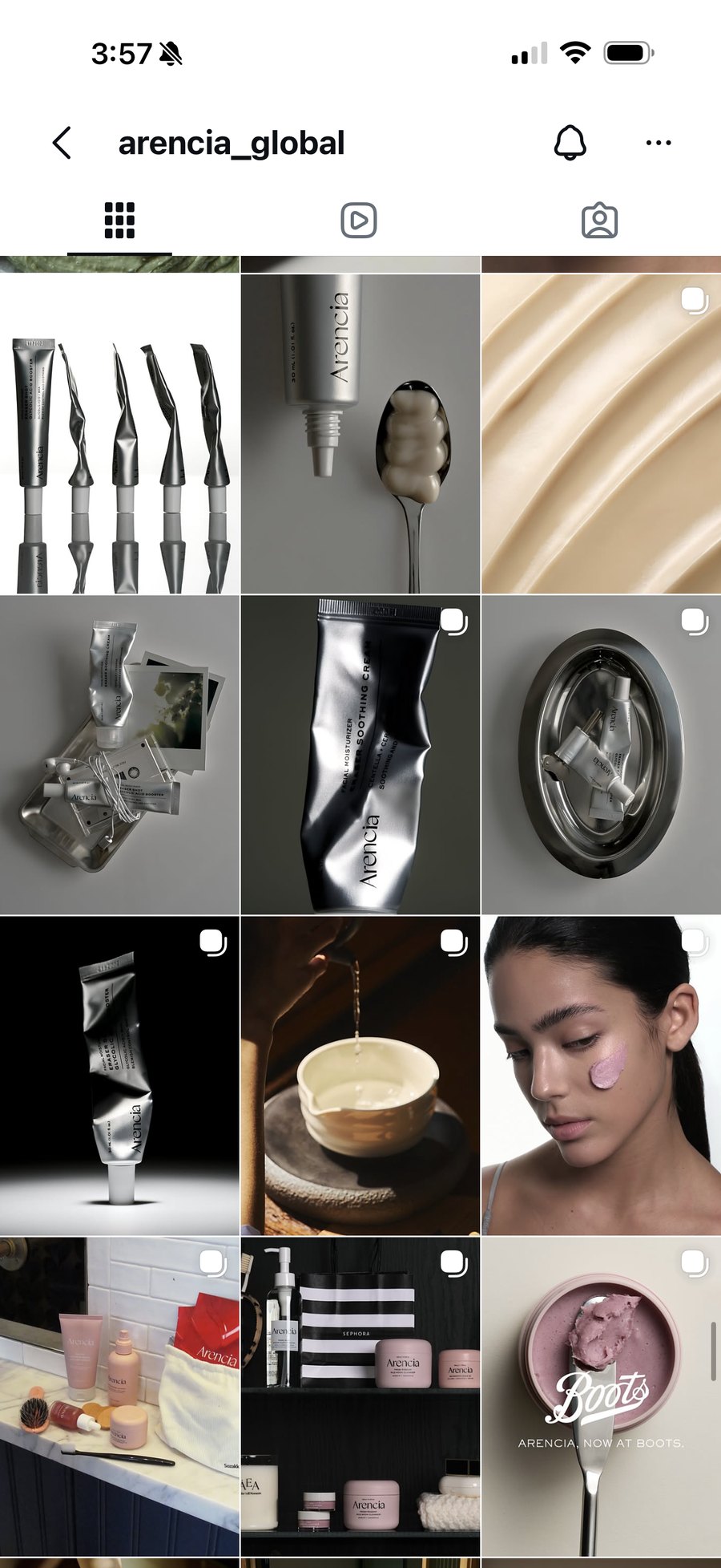
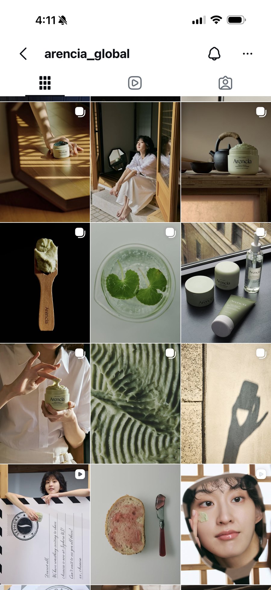
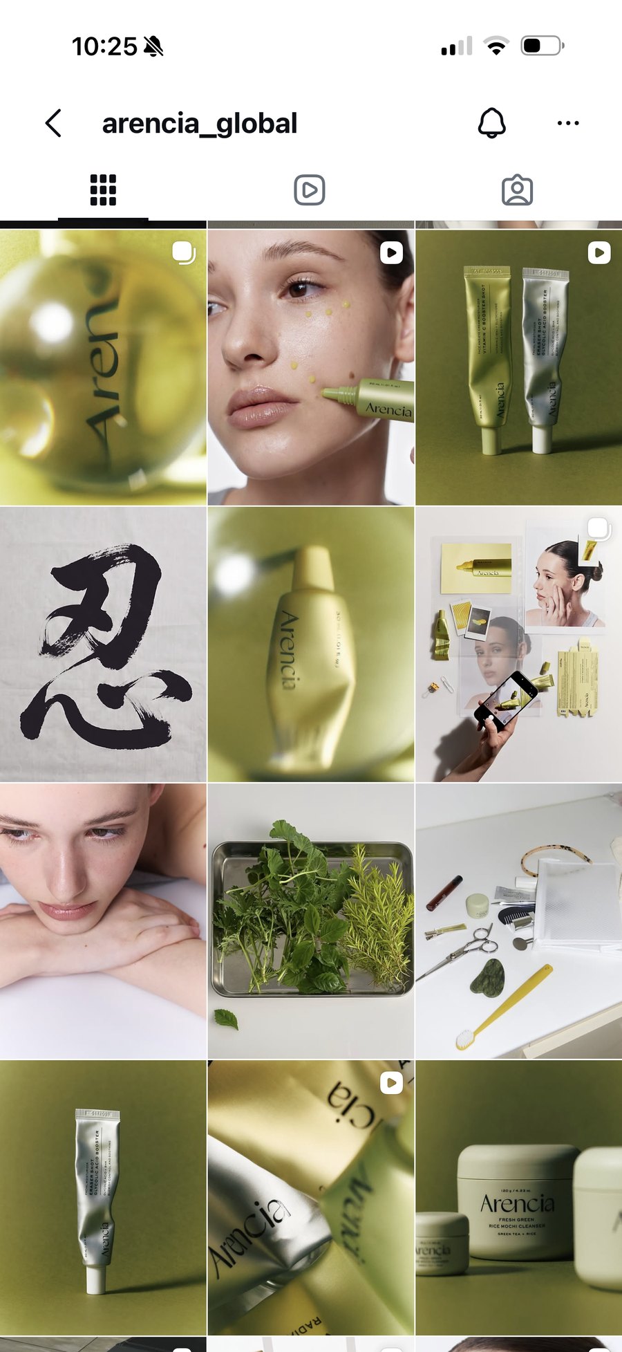
After reviewing past campaigns, I identified three main problems with the brand’s existing Instagram content.
Problem 1
The feed lacked a consistent, recognizable visual identity.
Problem 2
Past posts didn’t connect or perform as well with U.S. audiences.
Problem 3
Posts didn’t clearly communicate Arencia’s brand values.
Goal
How might we create a social media campaign that builds a stronger, more recognizable brand presence for Arencia among U.S. consumers?
My role
I worked with Arencia’s marketing team to shape the creative direction for the rebrand. I researched past campaigns, explored ways to visually communicate the brand’s values, and collaborated with the filming team to bring these ideas to life.
01 Research
Reviewed past campaigns, identified areas for improvement, and researched how competitor brands communicated similar values through their content.
02 Creative direction
Developed three concepts, each representing one of Arencia’s brand values. Created a creative direction deck outlining the backgrounds, props, composition, and lighting for each shoot.
03 Handoff
Used the deck to communicate the concepts and visual references to the filming team ahead of production.
04 Production
Worked with the filming team across three shoots to create a cohesive 12-post Instagram grid and a short-form video.
Research
Brand story
I worked with the marketing team to identify three key brand values we wanted to communicate through the campaign.
01
Time-intensive processes rooted in Korean tradition.
02
Natural ingredients and processes that preserve their benefits.
03
Modern skincare research behind effective formulas.
Competitor campaign analysis
I analyzed campaigns from beauty brands with similar values to Arencia, focusing on how they used color, lighting, textures, and composition to communicate those values visually.


Dr. Althea — 345 Line campaign


Aesop — Aurner Eau de Parfum campaign
Insights
I noticed that scientific and artisanal brands often use very different visual styles. Since Arencia combines both values, I wanted to bring elements from each into the campaign while keeping the overall feed consistent.
What I noticed
Brands like Dr. Althea use metallic tones, reflective surfaces, and minimal compositions to create a clean, scientific look.
How I applied it
I incorporated silver tubes, metal trays, close-up photography, and glass distortion into the scientific and natural posts.
What I noticed
Brands like Aesop use textured materials, hand-drawn details, warm tones, and visible hands to emphasize craftsmanship.
How I applied it
I incorporated traditional paper textures and brush calligraphy into the artisanal posts, along with a hand-stitched passport and hand-stamped details for the video.
What I noticed
Combining scientific and artisanal elements without a consistent visual direction could make the posts feel like they belong to different brands.
How I applied it
I used olive green, gold, and soft white across all 12 posts to connect the different visual styles and create a more cohesive feed.
Post grid
12-post Instagram grid
I developed a visual direction for each of Arencia’s three brand values, outlining the backgrounds, props, composition, and lighting in a creative direction deck. I worked with the filming team to bring these concepts to life across three shoots, creating a cohesive 12-post Instagram grid.
Below are the creative directions and final posts for each brand value. See the full grid on @arencia_global.
01
Time-intensive processes rooted in Korean tradition.


02
Natural ingredients and processes that preserve their benefits.


03
Modern skincare research behind effective formulas.


Video
Short-form video
I developed a passport-control concept to represent Arencia’s arrival in the U.S. and worked with the filming team to bring it to life. Each passport represents someone with a different skin concern and gets stamped with the Booster Shot designed to address it.
For the creative direction, I proposed using textured paper, hand-stitched passports, and handwritten names to give the video a personal, handmade feel. I also suggested varied camera angles and close-up shots to add movement, with the stamping action as the main focus.
A passport is received and opened to reveal a skin concern.
The matching Booster Shot is stamped onto the page, and the passport is returned.
The process repeats with different names, skin concerns, and Booster Shots.
The video ends with the Arencia logo stamped onto a blank page.
Impact
Results
Results measured from the campaign launch in August 2026 through October 2026.
+16%
Global search interest
Google Trends
320K+
Views
12.5K+
Likes
+2.4%
Follower growth
+11%
Profile visits
Reflection
01
This project taught me how to use research to make more intentional creative decisions. Instead of just focusing on what looked good, I learned to think about why certain visual elements worked and how they could help communicate Arencia’s brand values. It was interesting to see how small decisions about color, lighting, and composition could shape the overall brand identity.
02
Working with the filming team taught me how important it is to communicate creative ideas clearly. I learned to make my directions more specific so the team could understand the look and feel I had in mind. It was rewarding to see the concepts I developed in the deck turn into actual photos and videos, while also learning to stay flexible and open to feedback during production.
03
I also learned to think beyond individual pieces of content and consider how they contribute to a larger marketing goal. This project helped me understand that creating a strong visual identity isn’t just about making posts look consistent. It’s also about communicating what makes a brand unique and connecting with the audience it’s trying to reach.